Somewhere in the last year, a lot of founders had the same experience. You describe the product in a prompt, watch an AI tool generate the landing page, and feel genuinely unstoppable. No waiting on a designer, no back-and-forth, just a shipped page in an afternoon.
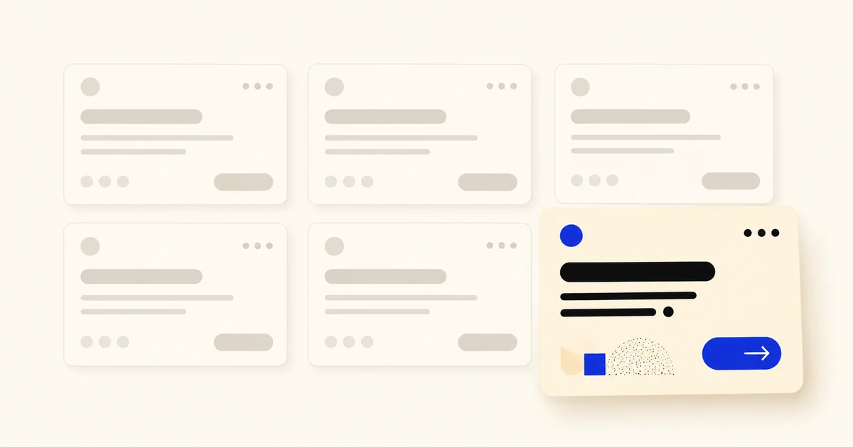
Then you put it next to fifty other AI-generated startup sites from the same few months. Same soft gradient background. Same 8px border radius on every button. Same “clean, modern” hero with a floating gradient blob. Same breezy, emoji-adjacent microcopy.
That gap between “this looks done” and “this looks like everyone else” is exactly what’s fueling a real, named pushback in the design world right now: Anti-Vibe Coding. Not anti-AI. Anti-sameness. And it’s worth understanding before you ship your next AI-drafted page, deck, or feature.
What “Anti-Vibe Coding” actually means
“Vibe coding” (describing what you want in plain language and letting an AI tool generate the interface or app) took off fast because it removed the biggest bottleneck founders complain about: waiting on design and dev time to test an idea. Tools built for exactly this made it possible for non-designers to go from idea to a working, good-looking screen in minutes.
The problem showed up once enough people did it. When many different products get built by AI models trained on similar data and optimized for the same usability heuristics, the output space compresses. Different companies, different offers, different audiences, yet the same interaction patterns, the same typographic choices, the same compositional logic, over and over. Individual screens look polished. Put side by side, they’re interchangeable.
Designers started calling the result “product slop,” and a straightforward but pointed correction has been building since: Anti-Vibe Codingisn’t a rejection of AI tools. It’s a rejection of using them without any point of view. The critique is aimed at the workflow (prompt once, ship the first draft, move on), not at the technology itself.
Where the sameness actually shows up
It’s rarely one obvious thing. It’s a stack of small, correct-but-generic decisions that add up to a site with no fingerprint:
- Visual system:the same neutral-palette-plus-one-accent-color combination, the same rounded-corner scale, the same drop shadows, because that’s what reads as “modern SaaS” to a model trained on modern SaaS sites.
- Layout logic:hero, three-icon feature row, testimonial carousel, pricing table, FAQ, footer, in that order, on every page, regardless of what actually matters for that specific product’s story.
- Copy voice:short punchy sentences, rhetorical questions, “here’s the thing” transitions: competent, readable, and indistinguishable from a hundred competitors.
- Trust signals:generic five-star rows and stock-photo “customer” avatars that read as filler rather than proof.
None of this is wrong, exactly. It’s just not differentiated. And for a product trying to convert a skeptical visitor into a paying customer, “competent but forgettable” is a real cost, not a neutral outcome.
Why this is a genuinely useful trend to pay attention to
It would be easy to read this as designers being precious about a tool that threatens their job security. It’s harder to make that argument when 91% of them are already using AI weekly, and 75% daily, up from just 54% a year earlier (Designer Fund and Foundation Capital’s “AI in Design 2026” report, based on 900+ designers surveyed in March). Once nine in ten of your peers are doing the same thing, “I use AI” stops being a differentiator and starts being table stakes. That’s the more useful way to read Anti-Vibe Coding: not resistance to the tool, but a market correcting for what happens once everyone has it. Buyers and users are getting good at spotting unedited AI output, and brands that leaned hard on it without review have already faced visible pushback and quietly gone back to a human-reviewed process.
That’s the actual lesson for founders: the tools compress drafting time, not judgment.A model can get you from blank page to a decent-looking screen in minutes. It cannot tell you whether that screen fits your actual brand, whether your real customer will trust it, whether it holds up on a five-year-old Android phone, or whether the “trusted by 500 companies” line it just wrote for you is even true.
Those are exactly the failure modes showing up most often in fast AI-shipped pages right now:
Accessibility gets skipped.Contrast ratios, focus states, and semantic markup aren’t things a prompt reliably asks for, so they’re often missing from the first (and only) draft.
Mobile behavior breaks quietly.A layout that looks great in a 1440px screenshot frequently collapses badly at 375px, and nobody checks because the desktop version already looked “finished.”
Proof gets invented or genericized. Placeholder stats and stock testimonials ship as real content because nobody circled back to swap them for the truth.
Positioning stays generic.The page answers “what does this look like” well and “why you, specifically” not at all, because a model can’t invent a differentiated argument you haven’t given it.
A fast, honest way to check your own site
Before you assume this doesn’t apply to you, it’s worth a five-minute audit:
- Screenshot your homepage hero next to two direct competitors’. If you covered the logos, could you tell them apart?
- Check your button radius, spacing scale, and accent color against three other tools in your category. Convergence here is the clearest tell.
- Read your headline out loud.If it could sit on literally any SaaS homepage in your category without editing, it’s not doing its job.
- Load the page on an actual old phone, not a resized browser window.
- Click every “trusted by” or testimonial claim.If you can’t point to the real source, a visitor eventually will wonder too.
Where this leaves the build-fast approach
None of this is an argument against AI-assisted design. DesignShare runs on it too, and the speed gains are real (we’ve written before about whether AI will actually replace designers, and the short answer is: not the judgment part). It’s an argument against skipping the review step that used to happen by default, back when a human always touched every screen before it shipped. The same pattern shows up in how Figma’s AI agents are changing startup design: faster generation, same need for someone senior reviewing what comes out the other end.
That’s the actual shape of the trade-off underneath Anti-Vibe Coding:
| Prompt-and-ship | AI-assisted, senior-reviewed | |
|---|---|---|
| Speed to first draft | Fastest | Fast |
| Visual originality | Low, converges to category defaults | High, reviewed against your actual brand |
| Accessibility | Usually skipped | Checked as part of the workflow |
| Mobile behavior | Rarely verified | Verified before ship |
| Proof/trust signals | Often generic or invented | Real, sourced, verified |
| Positioning | Generic to the category | Specific to your actual differentiator |
The fast part isn’t the problem. Shipping the first draft without anyone senior looking at it is.
This is the whole premise behind DesignShare’s model: an unlimited design subscriptionthat pairs the same AI-assisted speed everyone’s using with a senior designer, a senior developer, and a project manager actually reviewing what goes out, for one flat monthly rate, with unlimited requests and no hiring risk. It’s also, concretely, what that review step is worth: one client, MdsyncNet, saw a 34% lift in trial-to-paid conversion off an onboarding redesign built this way. That’s the kind of number a faster first draft alone doesn’t produce. If you want the speed without shipping “product slop,” see the pricing or grab 15 minutes to talk through what you’re building.