A patient opens your app for the first time. They are not excited. They are slightly anxious, a little skeptical, and holding something they do not hand over easily, their health and their data. In the next ninety seconds they decide whether you are safe to keep or safe to delete.
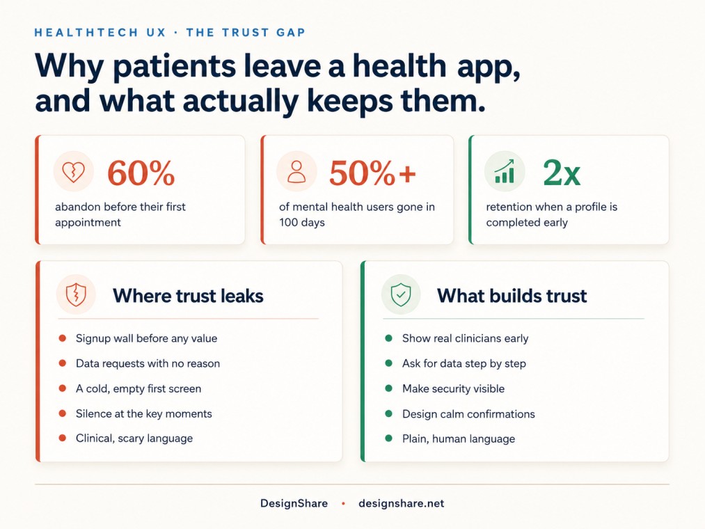
Most HealthTech products lose them in that window. Around 60% of health app users abandon before they ever book a first appointment. More than half of mental health app users are gone within the first hundred days. These are not people who decided the product was useless. Most of them never got far enough to find out.
Here is the uncomfortable truth we have learned building these products. In health, trust is not a nice layer you add on top of the experience. Trust is the product. And it is won or lost almost entirely through design decisions, not technology.
Trust is the feature you are actually shipping
Every other category gets to earn trust slowly. A project tool can be a little clunky and still keep you. A health product does not get that grace. The stakes feel personal from the first tap, so the doubts show up immediately. Is this legitimate. Are real clinicians involved. Where does my data go. What happens if I get this wrong.
If your interface does not answer those questions before the user thinks to ask them, they answer for themselves, and the answer is usually no.
This is why two HealthTech apps with nearly identical features can have completely different retention. The winner is rarely the one with more features. It is the one that made the user feel safe faster.
The numbers worth keeping in front of you
A few figures from recent research that frame the problem.
Roughly 43% of people in the US now use health apps, according to Rock Health, so the audience is real and growing. The mHealth market is on track to pass 268 billion dollars by 2034. The demand is not the issue.
Retention is. Around 60% abandon before booking a first appointment, and over 50% of mental health app users drop off inside the first hundred days. On the trust side, the health data of more than 259 million Americans was compromised in a single recent year, and the average healthcare data breach now costs close to 9.8 million dollars. Your users have read those headlines. They arrive already nervous about handing you anything.
And one number that points straight at the fix. Apps that get a user to a complete health profile before the first appointment see about twice the retention. Getting people to share, calmly and early, changes everything that follows. That is a design problem, not a technology one.
Where health products quietly lose trust
In our work redesigning these flows, the same leak points show up again and again. None of them are bugs. They are design decisions nobody questioned.
The wall before any value. The product asks for an account, a full profile, insurance details, and consent before the user has seen a single useful thing. Every field is a reason to leave, and in health the patience is thinner than anywhere else.
The data grab with no reason given. You ask for date of birth, medications, symptoms, sometimes a photo, and you explain none of it. In a banking app that feels nosy. In a health app it feels alarming.
The cold empty screen. The user finishes signup and lands on a blank dashboard with no clear next step. In a category built on reassurance, silence reads as abandonment.
The unguarded moment. The instant something real happens, a payment, a booking, a test result, a message to a clinician, and the screen goes quiet or vague. That is the exact moment a nervous user needs a clear, calm confirmation, and most products give them a spinner and hope.
The clinical voice. Interfaces written in the language of the medical team, not the patient. Jargon, scary phrasing, and dense forms make people feel like they are doing something risky and complicated.
The patterns that build trust
The good news is that trust is buildable, and the moves are concrete. These are the patterns we lean on when we design HealthTech products.
Show the humans. Put real clinicians, names, photos, and credentials in front of the user early. People trust people far more than they trust a logo. Seeing that there are actual doctors behind the app removes one of the biggest doubts in the first session.
Earn data one step at a time. Use progressive disclosure. Ask for the minimum to deliver the first bit of value, then request more only when the context makes the reason obvious. And say why you need each thing in plain words. People will share a surprising amount when you tell them what it is for. It is the same principle behind the best SaaS onboarding flows that convert, raised to higher stakes.
Make security visible without making it scary. A small, clear line that their data is encrypted and private, placed exactly where they are about to share something, does more than a privacy policy nobody reads. Show the lock at the moment of doubt, not buried in a footer.
Design the reassurance moments on purpose. Map the points where money or health data moves and treat each one as a feature. A clear confirmation, a plain summary of what just happened, a calm next step. These moments are where trust compounds or breaks.
Lower the cognitive load when the stakes are high. One question at a time. Clear hierarchy. Generous space. When a person is anxious, a busy screen feels like risk. A calm screen feels like competence.
Speak like a person, not a chart. Replace clinical language with plain language. Tell users what to do and what it means for them. Confidence comes from feeling understood, not from being impressed.
None of these are expensive features. They are design choices, and they are the difference between a product people delete and one they rely on.
Trust and compliance are not the same thing
A lot of founders assume that if they are HIPAA compliant, trust is handled. It is not. Compliance is the floor. It keeps you legal and it protects data behind the scenes. Trust is what the user actually feels in the interface.
You can be fully compliant and still feel sketchy, if the experience is cold, confusing, or silent at the wrong moments. And the regulatory bar keeps rising. 2026 brings updated HIPAA privacy notice requirements and new interoperability standards, so the backend work is real. But passing an audit and earning a nervous patient’s confidence are two different jobs. The first is legal. The second is design. You need both, and most teams only budget for one.
A quick gut check for your product
Open your own product as if you were a first time, slightly worried patient and ask a few honest questions. How long before I see something useful. Do I know who is behind this. When I am asked for data, do I understand why. When something important happens, does the product clearly tell me it worked. Does it talk to me like a person.
If you hesitated on any of those, that is where your users are hesitating too, and hesitation in health is the sound of someone reaching for the delete button.
Why we are telling you this
We design and build these products. DesignShare is the design and front end team behind Elegant IT Limited, a studio founded in 2017 with more than 170 clients and 315 plus projects shipped. We have redesigned onboarding and trust flows for real products, and we have watched what a focused redesign does to the numbers. In one case, reworking a product’s onboarding took trial to paid conversion from 18% to 34%. Same product, no new features, just a better designed experience.
Get the trust right and everything downstream, retention, conversion, word of mouth, gets easier.
HealthTech is where this matters most, because the cost of a confusing screen is not a lost click. It is a person who needed something and walked away. If you are weighing whether to handle this in-house or with a partner, our cost breakdown of a subscription vs hiring vs an agency lays out the trade-offs.