Six patterns from AI products we've reviewed this year. Each one looks small on a screen. Each one quietly kills adoption.
The stat that should worry you more than benchmarks
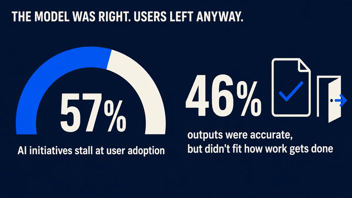
Here's the number AI founders don't put in their pitch decks. When enterprise leaders were asked where AI initiatives stall, 57% said user adoption after launch. Not accuracy. Not cost. People simply not using the thing. And 46% said something stranger: the outputs were accurate, but the product still didn't fit the way work gets done.
Read that again. The model was right and the users left anyway.
57% of enterprise leaders say AI initiatives stall at user adoption after launch, not accuracy or cost; 46% say the outputs were accurate but still didn't fit how work gets done.
We've spent the past year designing interfaces for AI products, and reviewing plenty more built by founders who came to us after launch. The failures repeat. Not model failures. Interface failures. The standard SaaS design playbook quietly breaks when your product's output is probabilistic, and most teams don't notice until the retention curve tells them.
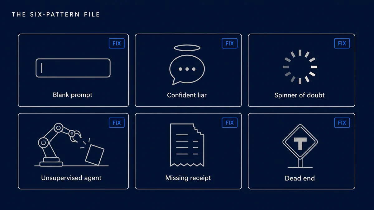
So here's our pattern file. Six things we keep finding in the wild, what users actually do when they hit them, and the fix we ship instead.
Pattern 1: The blank prompt
What founders ship. A beautiful empty text box. Maybe a placeholder that says "Ask me anything." The team assumes an open canvas signals power.
What users actually do. They freeze. They type something vague, get a mediocre answer, and conclude your product is mediocre. Industry teardowns of first-session behavior put the damage bluntly: a blank prompt loses around 60% of users before they've really started, while a well-designed first run converts closer to 78%.
The fix. Never open on empty. Show three starting points built from whatever you already know about the user, and make each one a real, context-rich example rather than "Summarize a document." The best AI onboarding we've shipped this year felt less like a chat box and more like a first small win the user just had to approve. We wrote about the mechanics of this in our SaaS onboarding teardown; AI products need every trick in that post, plus expectation-setting on top.
Pattern 2: The confident liar
What founders ship. Every answer rendered in the same calm, authoritative tone, whether the model is 95% sure or guessing.
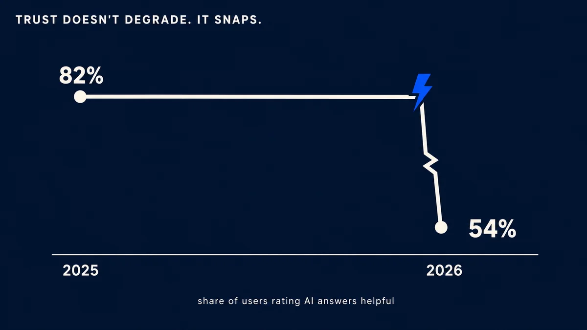
What users actually do. They get burned once, then treat everything your product says as suspect. Trust doesn't degrade gradually. It snaps. Across 2026 surveys, the share of people who call AI answers helpful fell from 82% to 54% in a single year, and the skeptics tripled.
The fix. Design uncertainty in, visibly. Confidence states, hedged phrasing on low-certainty claims, a different visual weight for "verified from your data" versus "generated." Users don't punish honesty. They punish surprises.
Pattern 3: The spinner of doubt
What founders ship. A generic loading spinner over a 20-second model call. The screen from 2015, in front of the technology of 2026.
What users actually do. They assume it's broken. Variable latency is native to AI and completely foreign to what SaaS trained people to expect. A spinner communicates nothing about whether 2 seconds or 40 remain, so users refresh, resubmit, or leave.
The fix. Stream everything you can. Show work in progress: which sources it's reading, which step it's on, partial output as it forms. Progressive reveal isn't decoration, it's the difference between "this is thinking" and "this is dead." If a step can't stream, give it an honest skeleton state with a real duration expectation.
Pattern 4: The unsupervised agent
What founders ship. An agent that takes multi-step actions with a single "Run" button, no preview, no undo, results announced after the fact.
What users actually do. They try it once on something that matters, watch it do one thing wrong, and never grant it autonomy again. The benchmark data says their caution is rational: even frontier agents still fail roughly one attempt in three on real computer-use tasks.
The fix. Supervision is the product. Show the plan before execution. Make every destructive step ask first. Keep an activity log a human can scan in ten seconds, and make undo boring and reliable. The founders who win with agents aren't the ones with the most autonomy, they're the ones whose users feel safe delegating twice.
Pattern 5: The missing receipt
What founders ship. Factual claims with no path to verify them. The answer just sits there, sourceless.
What users actually do. The careful ones re-check everything in another tab, which doubles their work and erases your value. The careless ones ship your hallucination to their boss. You lose either way, and in 2026's climate you lose fast: heavy, unexplained AI output now carries a measurable brand-trust penalty that has nearly doubled year over year.
The fix. Receipts by default. Inline citations that expand, "according to" phrasing tied to real documents, and a visible boundary between retrieved fact and generated prose. If your product can't show where an answer came from, that's a roadmap item, not a styling gap.
Pattern 6: The dead end
What founders ship. Output with two options: accept it or start over.
What users actually do. They leave. An AI product without an edit-and-steer loop feels like a slot machine, and nobody builds their workflow on a slot machine.
The fix. Every output needs three affordances: refine it, correct it, or reject it with a reason the system remembers. Users who know they can steer engage measurably more. This is also where your product gets smarter, because corrections are the best training signal you'll ever collect, and it's the one pattern on this list that compounds.
Why this keeps happening
None of these patterns come from lazy teams. They come from good SaaS habits applied to a product that no longer behaves like SaaS. Deterministic software earned the right to look confident, load silently, and skip the receipts. Probabilistic software hasn't, and users can feel the difference even when they can't name it.
That's also why we'd argue this is a design problem before it's an engineering problem. Jakob Nielsen made the same point this year from the research side: the AI products lagging worst aren't short on model capability, they're short on organizations willing to treat UX as load-bearing.
We're biased here, and openly. Interface judgment for AI products is a large part of what founders hire DesignShare for: a senior product design team on a flat $3,495 a month, one request at a time, about 48 hours per turnaround, pause whenever you like. We've shipped these six fixes enough times that they're checklist items for us now, not discoveries. And if you're wondering whether AI tooling alone gets you there, we covered why generated output still needs an owner in the tool-sprawl post.